Tuesday, 30 April 2013
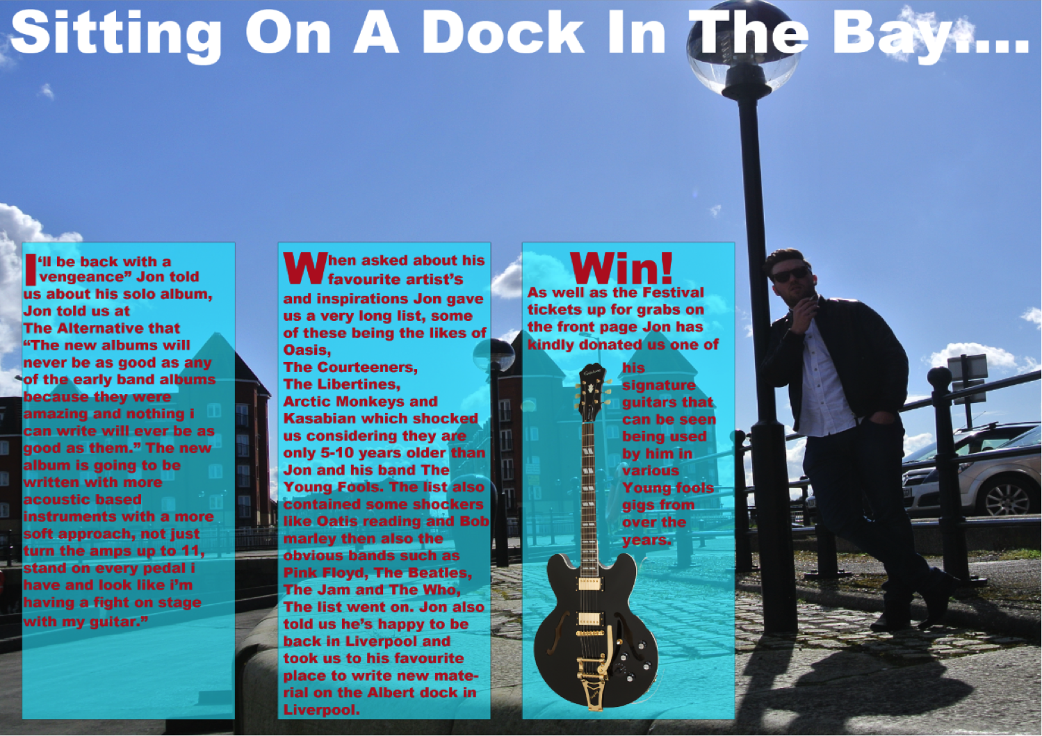
Double page spread finished product (Draft 1)


Friday, 19 April 2013
Front cover screenshots
Below is a step by step time line of each time i added something to my front cover, as you can see i created the front cover in 12 steps.

Below is an image of the final product

Tuesday, 12 March 2013
Concept's
'Front Cover
The front cover of my magazine is going to feature a medium shot of a solo artist standing in the Albert dock Liverpool with a back ground of either a brick wall or the River Mersey. The main Headline will be "Back In Liverpool". The front cover of the magazine will consist of: A Banner, puff, main headline, sub headline, barcode, secondary images, cover line, buzzword and a master head logo. The genre my magazine will be featuring is Alternative rock with examples such as: Oasis, Arctic monkeys, Blur, Kasabian, The Courteeners, The Libertines Etc.

Contents page
The contents page of my magazine will just be a basic contents page that will let the reader know where about the main story's are in the magazine by giving a page number. Below is an image of a basic mock up i made so show how it will be set out.

Double Page Spread
The double page spread will be split into two pages. One page, probably the left will be a giant image that fills the whole page. The image will either be a similar one too the one on the front cover but will have a different back ground and a different guitar and could possibly have another band member on it instead of just the frontman or will be a completely different image with a different band member on it. The other page will be the same picture as it ill be a giant image stretched across the two pages but will have the text on it

The front cover of my magazine is going to feature a medium shot of a solo artist standing in the Albert dock Liverpool with a back ground of either a brick wall or the River Mersey. The main Headline will be "Back In Liverpool". The front cover of the magazine will consist of: A Banner, puff, main headline, sub headline, barcode, secondary images, cover line, buzzword and a master head logo. The genre my magazine will be featuring is Alternative rock with examples such as: Oasis, Arctic monkeys, Blur, Kasabian, The Courteeners, The Libertines Etc.

Contents page
The contents page of my magazine will just be a basic contents page that will let the reader know where about the main story's are in the magazine by giving a page number. Below is an image of a basic mock up i made so show how it will be set out.

Double Page Spread
The double page spread will be split into two pages. One page, probably the left will be a giant image that fills the whole page. The image will either be a similar one too the one on the front cover but will have a different back ground and a different guitar and could possibly have another band member on it instead of just the frontman or will be a completely different image with a different band member on it. The other page will be the same picture as it ill be a giant image stretched across the two pages but will have the text on it

Analysis of front cover of a maqazine
 The NME is an iconic well recognised music magazine that has been around since march 1952. The key image is a medium shot of the Libertines frontman, solo writer and poet Peter Doherty. The colour scheme of this cover is white which is not normal as the NME usually has a red title. Peters facial expressions are linked to the audeince threw the mode of adress, his facial expression shows seriousnes which makes the readers want to buy the magazine to see whats inside, Also that months NME shows the "True confessions of Pete Doherty" which will reveal several things like the relationship with the singer Amy Winehouse and also talks about his Drug adiction and The Libertines.
The target audience of this magazine is anyone who enjoys alternative or rock and roll music but is specificly for Libertine fans. As you can see Peter is not covering any of the NME logo, if it was it would be super imposition, this has not hapened in that months issue as the logo as been changed white therefore it already attracts the readers. This magazine has Codes and conventions such as a Masthead, banner, cover-lines, a barcode, a puff and sub headings.
Front Cover Magazine Review

Camera shots
Some of the technical codes are camera shots, the shot that is featured on this magazine is a medium shot because only half of his body can be seen on the image. the images shows a confident young man that symbolises people who go to this college will be happy, confidant and enjoy the college thus engaging people to join.
Lighting
The lighting in this image is bright which represents positivity and happiness, once again this engages people to buy the magazine and possibly encourage them to enrol in the college.
Angles
the angle in this shot is a low shot as he is clearly visible and his head is at the very top of the image.
what images have been used
What camera angles and shots have been used?
what is the mise-en-scene on the frint cover?
qould the fromt cover engage audience and why?
whi is the target auedence and how does the magazine engage the target audence
how do you know it is for the target audence
what os the ideology of the magazine? what does the college consider important
Who is the target audience The target audience for this magazine for the students of the specific college,the magazine s appropriate fir the teachers and possible students who are intending to go there. It's suitable for both male and female to read as it's gender neutral, the college is a mixed college therefore its appropriate.
How this could help me with my magazineThis magazine helps me by showing what I should include, it shows me the appropriate pictures and headlines i can use. It also shows me how not to design my magazine, and helps me to understand how presentation is very important in catching the readers eye and interest.
Magazine cover

Subscribe to:
Posts (Atom)